毎日弁当の中身に困っているエンジニアへ | お弁当をランダムで決められるサイトを作ってみた
BLOG

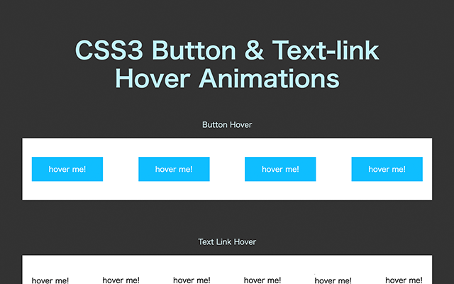
マウスでボタンをかざした時に起きる動きです。
HTMLの要素を用意します。
aタグの中にテキストを入れます。
ホバーアニメーションによってテキストをspanで囲うことが必要です。
<a href="#" class="button">詳しく見る</a>通常のCSSを当てます(ホバーしていない時)
.button {
  margin-bottom: 40px;
  height: 50px;
  width: 150px;
  display: grid;
  place-items: center;
  color: #fff;
  text-decoration: none;
  background-color: #000;
  position: relative;
  border: 1px solid #000;
  transition: all .6s ease;
}
最後に transition: all .6s ease;を追加することで、ホバーした時に滑らかにホバー状態に変更します。
transitionとは省略の形で、入るプロパティはこの4つです:
CSSでボタン要素に:hoverを付けて、ホバーした時のスタイルを当てます。
.button {
  &:hover {
    opacity: 0.7;
  }
}transform、keyframesとanimation、擬似要素の::beforeと::afterなどを使うことでより複札な演出ができます。いくつかのバリエーションを用意しましたのでご参考ください。
.button{
 &:hover {
  color: #000;
  background-color: #fff;
 }
}今までの例と少し構造を変えます。
テキストをspanの中に入れて、z-indexで上に表示するようにします。
<a href="#" class="button"><span>詳しく見る</span></a>CSSで、overflow: hiddenを追加します。
違う色で、aタグと同じ大きさの擬似要素を作り、transform: translateX(-100%);で左側の表示領域外に移動します。ホバー時にtransform: translateX(0);を付けることで表示エリアに横移動させます。
.button {
 overflow: hidden;
 background-color: #000;
 position: relative;
 color: #fff;
 &::before {
  content: "";
  height: 50px;
  width: 150px;
  display: block;
  position: absolute;
  transform: translateX(-100%);
  background-color: #fff;
  transition: all 0.3s ease;
 }
 span {
  position: relative;
  z-index: 1;
 }
 &:hover {
  &::before {
   transform: translateX(0);
  }
  span {
   color: #000;
  }
 }
}テキストリンクのtext-decorationを使わずにカスタムの線アニメーションもできます。
上記のボタン形式と同じHTMLが使えます。
<a href="#" class="textlink">詳しく見る</a>text-decoration: noneでデフォルトの下線を無効にし、擬似要素でbackground-color: #000、width: 100%とheight: 1px、で線を作りますが、下線はborder-bottomで作ることもできます。
どのようにアニメーションつけるかによって選んでください。
テキスト要素にoverflow: hiddenもかけると線を動かすときは見えない。
.textlink {
  color: black;
  text-decoration: none;
  transition: all .3s ease;
  display: inline-block;
  padding-bottom: 1px;
  position: relative;
  overflow: hidden;
  &::before {
    content: "";
    position: absolute;
    display: block;
    width: 100%;
    height: 1px;
    background-color: #000;
    bottom: 0;
  }
}
keyframesでアニメーションを作り、ホバーした時に実行するようにします。
@keyframes anim {
  0% {
    transform: translateX(0)
  }
  49% {
    transform: translateX(100%)
  }
  50% {
    transform: translateX(-100%)
  }
  100% {
    transform: translateX(0)
  }
}
.textlink {
  &:hover {
    &::before {
      animation: anim 1s ease;
    }
  }
}