毎日弁当の中身に困っているエンジニアへ | お弁当をランダムで決められるサイトを作ってみた
BLOG

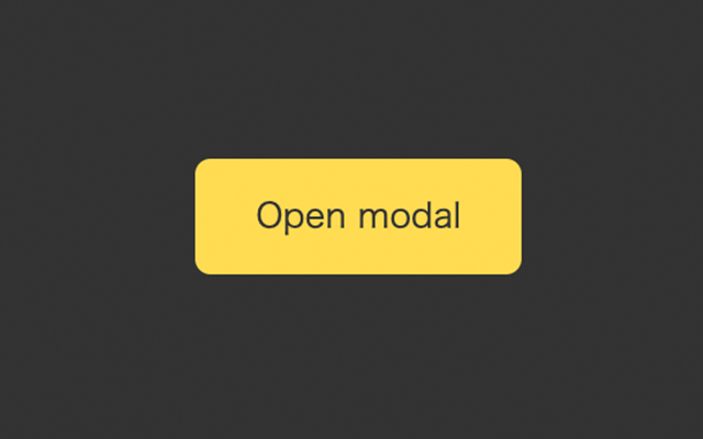
ボタンを押すとモーダルが表示されます。
HTML要素を用意します
モーダルを表示させるボタンと、モーダルの要素を追加します。
/* ボタン */
<div class="wrapper">
  <button id="btn" class="btn">モーダルを表示する</button>
</div>

/* モーダル */
<div id="modal" class="modal">
  <div class="modal__content">
    <h2 class="modal__title">タイトル</h2>
    <div class="modal__text">この文章はダミーです。文字の大きさ、量、字間、行間等を確認するために入れています。この文章はダミーです。文字の大きさ、量、字間、行間等を確認するために入れています。この文章はダミーです。文字の大きさ、量、字間、行間等を確認するために入れています。</div>
    <div id="close" class="close">
      <span class="close__line1"></span>
      <span class="close__line2"></span>
    </div>
  </div>
</div>CSSで要素をスタイリングします。
.modal {
  position: absolute;
  top: 0;
  left: 0;
  width: 100vw;
  height: 100vh;
  display: none;
  place-content: center;
  background-color: rgba(0, 0, 0, 0.3);
  backdrop-filter: blur(2px);

  &__content {
    background-color: #fff;
    width: 60%;
    border-radius: 12px;
    padding: 32px;
    margin: 0 auto;
    position: relative;
  }

  &__title {
    color: #eb6100;
    line-height: 1;
  }

  &__text {
    color: #6d6d6d;
  }
}

.close {
  position: absolute;
  width: 20px;
  height: 20px;
  top: 9%;
  right: 3%;
  transition: opacity 0.4s ease;

  &:hover {
    opacity: 0.6;
  }

  &__line1 {
    display: inline-block;
    width: 100%;
    height: 2px;
    background-color: #000;
    position: absolute;
    transform: rotate(45deg);
  }

  &__line2 {
    display: inline-block;
    width: 100%;
    height: 2px;
    position: absolute;
    background-color: #000;
    transform: rotate(-45deg);
}JavaScriptで以下の処理を行います。
const btn = document.getElementById("btn");
const close = document.getElementById("close");
const modal = document.getElementById("modal");

const removeModal = () => modal.style.display = "none";

// ボタンをクリック
btn.addEventListener("click", () => {
  modal.style.display = "grid";
})

// Xをクリック
close.addEventListener("click", () => {
  removeModal();
})

// モーダルの外側をクリック
modal.addEventListener("click", (e) => {
  if (e.target === modal) removeModal();
});