毎日弁当の中身に困っているエンジニアへ | お弁当をランダムで決められるサイトを作ってみた
BLOG

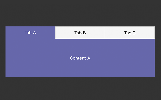
よくあるデザイン、タブ切り替え。
アクセシビリティを考慮して、WAI-ARIAに対応した書き方を説明します。
なし
まずはhtmlです。
ポイントはrole属性とaria属性でしょうか。
・タブを囲ってる要素、.tab-groupはrole="tablist"
・タブのボタンとしての機能を持つbutton.tabはrole="tab"
上記2つは親子関係になります。
・role="tabpanel"はタブに対してのコンテンツの要素になります。
・aria-controlsはタブパネル (tabpanel) ロールを持つ要素の idと紐づいています。
・タブは、選択されている時にaria-selected="true"になります。
・パネルは非表示のとき(選択されてない時)にaria-hidden="true"になります。
<div class="tab-area">
	<ul class="tab-group" role="tablist">
		<li role="presentation">
		  <button class="tab" role="tab" aria-controls="panel01" aria-selected="true">Tab A</button>
		</li>
		<li role="presentation">
		  <button class="tab" role="tab" aria-controls="panel02" aria-selected="false">Tab B</button>
		</li>
		<li role="presentation">
		  <button class="tab" role="tab" aria-controls="panel03" aria-selected="false">Tab C</button>
		</li>
	 </ul>
   <div class="panel-group">
		<div class="panel" id="panel01" role="tabpanel" aria-hidden="false">Content A</div>
		<div class="panel" id="panel02" role="tabpanel" aria-hidden="true">Content B</div>
		<div class="panel" id="panel03" role="tabpanel" aria-hidden="true">Content C</div>
	</div>
</div>下記はcss(SCSS)になります。
aria-selected属性とaria-hidden属性で、表示・非表示状態のスタイルを切り替えます。
アクティブな時の背景色は、2022年のトレンドカラーのラベンダー「ベリーペリ(Very Peri)」を使用してみました。
@keyframes show{
    from {
        opacity: 0;
    }
    to {
        opacity: 1;
    }
}


.tab-area {
  padding-top: 100px;
}


.tab-group {
  display: flex;
  justify-content: center;
  list-style-type: none;
  margin: 0;
  width: 600px;
  margin-left: auto;
  margin-right: auto;
  padding-left: 0;
}


.tab {
  width: 200px;
  height: 50px;
  border-top: solid 1px #CCC;
  border-left: solid 1px #CCC;
  border-right: solid 1px #CCC;
  border-bottom: none;
  text-align: center;
  cursor: pointer;
  font-size: 16px;
  background-color: #f5f5f5;

  &[aria-selected="true"] {
    background-color: #6667ab;
    color: #FFF;
    transition-property: color, background-color;
    transition-duration: 0.4s;
    transition-timing-function: ease;
    border: none;
  }
}


.panel-group {
  border-top: none;
  display: flex;
  align-items: center;
  justify-content: center;
}


.panel {
  display: none;
  width: 600px;
  margin-left: auto;
  margin-right: auto;
  background: #f5f5f5;
  text-align: center;
  padding: 70px 0;

  &[aria-hidden="false"] {
    display: block;
    animation: show .4s ease;
    background: #6667ab;
    color: #fff;
  }
}
tabSwitchというコールバック関数を作成しています。
タブをクリックするとtabSwitchが実行されるような仕組みです。
Array.prototype.slice.call(tabs);
→.tabのclassを持つ要素を配列に変換
arrayTabs.indexOf(this);
→配列から、指定した要素の順序を取得
document.getElementsByClassName('panel')[index].setAttribute('aria-hidden', 'false');
→.tabと同じ順序の.panel要素のaria属性を指定
document.addEventListener('DOMContentLoaded', function () {
  const tabs = document.getElementsByClassName('tab');
  for(let i = 0; i < tabs.length; i++) {
    tabs[i].addEventListener('click', tabSwitch);
  }


  function tabSwitch(){
    // タブのaria属性変更
   document.querySelector('.tab[aria-selected="true"]').setAttribute('aria-selected', 'false');
   this.setAttribute('aria-selected', true);

    // パネルのaria属性変更
    document.querySelector('.panel[aria-hidden="false"]').setAttribute('aria-hidden', 'true');
    const arrayTabs = Array.prototype.slice.call(tabs);
    const index = arrayTabs.indexOf(this);
    document.getElementsByClassName('panel')[index].setAttribute('aria-hidden', 'false');
  };
});タブ切り替えのサンプルです。
デベロッパーツールで見ると、aria属性が変化してるのが分かるかと思います。